Branding - Panacea
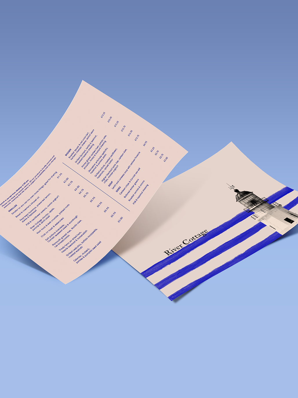
'Panacea' is a modern yet artisanal bakery located in Madrid city centre. The business has three different parts: the bakery, the cafeteria and a workshop area for providing bread making courses to those who are interested in it. As a result of these different streams of the business there is not just one kind of target but three that we have to keep in mind to design this brand. The bakery will attract working adults looking for quality bread; the cafeteria target will probably be a lot more heterogeneous as it is based on impulsive purchases – people would see the cakes through the window and make an immediate decision to buy one. Finally, the courses are addressed to adults interested in artisanal products, with a stable job and income as well as having some free time available. Similar brands in the area have been analysed in order to understand this business sector’s graphic language. Their main characteristic is the use of logotypes where the text and its typeface are the most relevant elements. In most of them, there is no symbol and if there is one, it tends to be abstract. The final result of this project is a logotype composed of the name of the shop and two strokes above and under it that imply the shape of a traditional bread oven. The colour of these two strokes is Pantone 138 UP, an ochre hue in reference to bread’s main ingredient - wheat. They have been traced with a texture brush in order to give the brand the artisanal look of the business. On the other hand, the typeface chosen is a sans serif which is clean yet distinctive and recognisable. Applications such as stationary, cafeteria menus, bags, mugs and aprons have been created in order to maintain brand consistency.
You may also like
